
Changing Tides Family Services' Logo Refresh
- Megan Phillips
- Mar 20
- 2 min read
Changing Tides Family Services is a family resource agency offering community-based services for behavioral and family empowerment and early learning and care. However, you wouldn’t have known that looking at their old logo.
The waves in their previous logo design left the impression that they were an environmentalist group, especially in an area that’s eco-conscious. The logo was difficult to scale smaller, and its ombre color-scheme was hard to convey when the design was printed in black and white.
Changing Tides was looking for a more modern logo, while still appreciating certain portions of their old one.
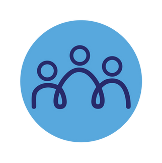
To honor that identity, the color blue and tide iconography from the former trademark were included in the new one. More importantly, the logo needed to convey Changing Tides identity: helping families in the Humboldt area with childcare services!
As a designer, I wanted to create waves using the letters of ‘Changing’ and ‘Tides’. In Illustrator, I explored combinations and found that connecting the C to the A had the most impact. The top of the T became its own wave, and I right aligned ‘Tides’ underneath ‘Changing,’ leaving a gap to the left. I filled that space with a family motif composed of simple, abstract lines.


At Illuminated Marketing, we always strive to set you up for success, providing you with all the logo files you may need in the future. For Changing Tides, we created a primary and secondary logo, wordmark, and an icon.


Changing Tides Family Services is now rocking a logo fit for the 2020s. They feel confident knowing they have the correct file for the apparel guy, the favicon (that tiny logo in browser tabs) for the website, and the design elements for their business cards. Above all else, they have a logo that finally communicates to their community who they are.


Comments